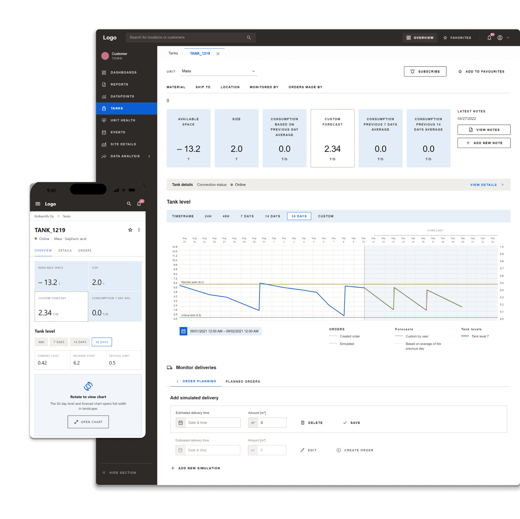
 Industrial
 Data & Expert Interface Design
Built practical expert tools for industrial data workflows, making complex calculations and monitoring more reliable for specialists.
View case study →Case study · University Digital Onboarding and AI Search Concept
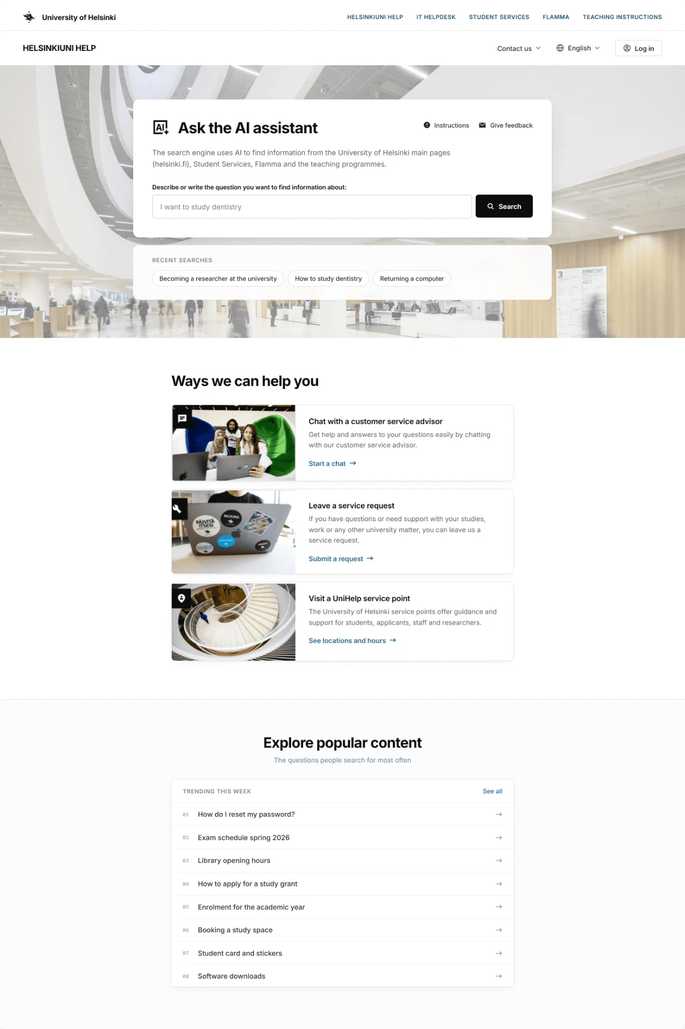
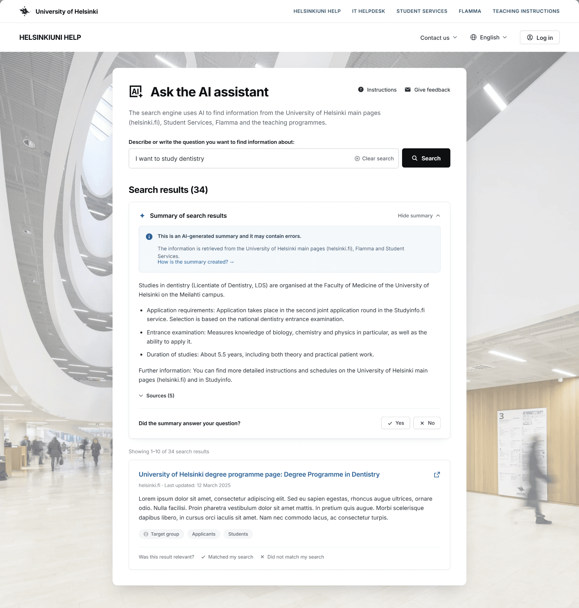
AI Search PlatformAn AI-powered search and service hub that lowers support pressure and helps students find what they need on their own.
Role: Senior UX & Product Designer
Focus: UX/UI Design, AI search flow, service architecture, Design System adoption, post-launch iteration
The brief
A major university had information scattered across many separate websites, so students, staff, and visitors often didn't know where to start looking. I joined as Senior UX & Product Designer to turn early concepts into real screens, test them with users, and shape the first version people could actually use.
Selected screens
Desktop and mobile, one platform
Results
These impacts were confirmed through user interviews and surveys carried out after launch.
Answers are found faster across channels, whether it's AI search, messaging, forms or an information desk.
When AI search and self-service handle everyday questions, staff have more time for situations that need personal support.
The implementation makes the service easy to use independently on a phone, on the go or with assistive technology.
New students and visitors don't need to know the university's structure beforehand: one entry point leads straight to the right information.
Background
A major university had information scattered across many different websites, making it hard for students, staff, and visitors to find help.
Service designers had already done the early research and mapped out the initial idea for a central service portal. My job as Senior UX & Product Designer was to turn those early concepts into real screen designs, test them with actual users, and refine them for the first product launch (MVP).
After launch, I stayed on to collect real user feedback and keep improving the service based on how people actually used it.
The hard parts
In hindsight
Keep reading
IndustrialBuilt practical expert tools for industrial data workflows, making complex calculations and monitoring more reliable for specialists.
View case study →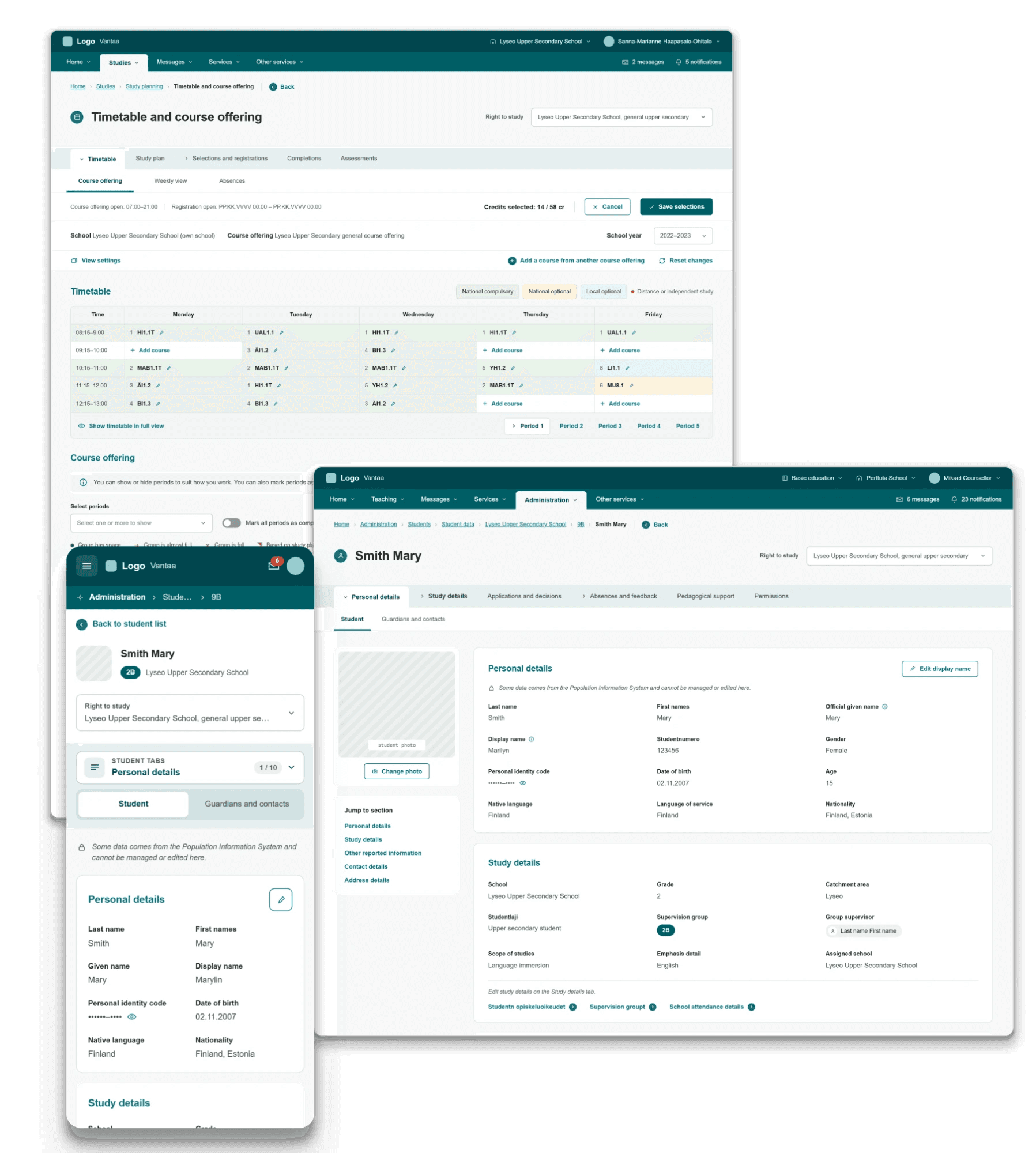 Public education
Brought structure to a massive public sector platform by uniting complex municipal school workflows into a clear, accessible tool for teachers and administrators.
View case study →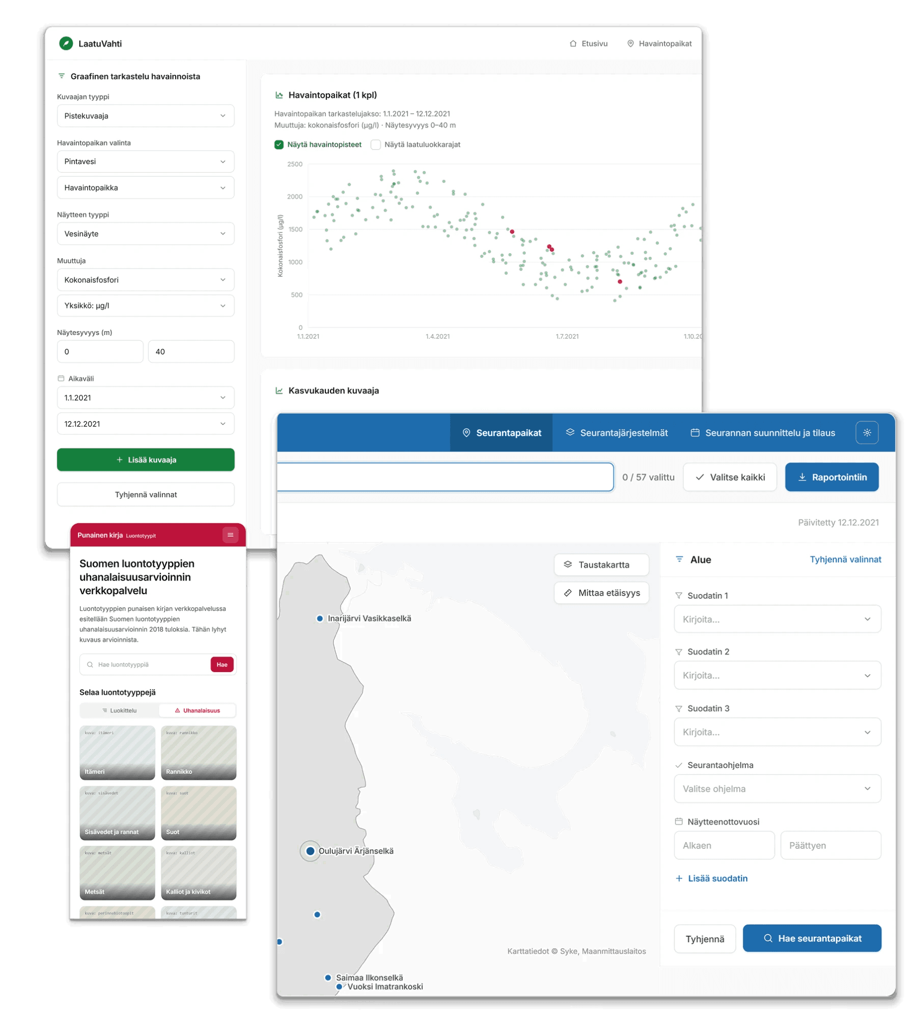 Environmental research
Transformed outdated systems into modern, efficient tools that help environmental researchers manage and analyze critical data.
View case study →